
99 Tracker
99 Tracker is a consumer product that helps users monitor and manage package deliveries across multiple carriers. Users relied on it to reduce uncertainty and avoid missed or failed deliveries.
I led the end-to-end product design, from problem definition through launch, partnering closely with engineering and stakeholders to improve delivery outcomes.
Duration
8 Weeks
My Role
Research
UX Design
IxD Design
Visual Design
Prototyping
Tools
Figma
Adobe Xd
Adobe PS
Adobe AI
Team
Enrique Alfaro (CTO)
Maryjose Torres (Web Dev)
Viridiana Trujillo (Product Designer)
“How might we provide information of deliveries for end-customers improving the delivery service experience? ”
00. context
99 Tracker was architected as an adaptive mobile-responsive platform to visualize and manage last-mile deliveries for 99 Minutos, a major Mexican ecommerce delivery provider. Prior to this project, 65% of deliveries were not successfully completed, primarily because users lacked clear communication and visibility into delivery status.
As the Product Designer working alongside engineering and product leadership, my responsibility was to ground design decisions in data and align business needs with user expectations
Project goal:
Improve delivery success by helping users anticipate and act on delivery events more effectively.
01. understanding
Benchmarking and API Research:
To understand similar services on the market, user expectations and other nuances, I did competitive studies, analyzed their UVPs, helpful features, and common user complaints.
This clients UVP (99 Minutos) is the ability to track in real-time an “immediate” e-commerce delivery.
Challenges 99 Minutos had before 99 Tracker:
65% of deliveries weren't successfully completed
Due to lack of communication with the end-user, the delivery status was unknown and therefore, not received.Lack of trust and reliability
The only communication channel was poorly designed giving it an unofficial feel and because of this, was not used.Unclear information and information absence
The information provided on the emails wasn’t focused on user needs rendering useless and unimportant to them.
User testing and synthesis:
I conducted a user survey with 50 participants (ages 18–45). Key findings revealed major gaps in user comprehension and trust:
12% understood that the email notifications were intended to show delivery status
18% clicked through to the existing status page
86% had confused official tracking emails with spam or scams at least once
10% found the status page clear and easy to follow
78% expressed frustration about the inability to communicate with couriers directly
These numbers indicated that the primary pain was not a lack of access, but interpretation, trust, and actionability.
Insight generation:
I organized research findings through affinity mapping and worked with the Product Manager to align with business KPIs. The research confirmed that:
Communication clarity was directly tied to delivery success
Users needed precise real-time tracking and interaction possibilities
Trust in the communications channel (email) was critical to engagement

02. key points to target
Real-time tracking that feels intuitive and comparable to modern delivery experiences
“I’m so used to follow my delivery on UberEats, I expect it to work similar since they are handing me goods as well” — Participant 3
Clear communication channels to coordinate with couriers
“I once lost a package delivery just because I couldn’t communicate to my courier that there was a roadwork on my street” — Participant 25
Trustworthy and actionable notifications that influence behavior
“I thought the email they (99 Minutos) sent me was a scam ‘cause of the poor design. I ignored it and never knew my package was sent my way” — Participant 35
03. solutions
Lo-Fi Wireframes
After synthesizing research, I developed low-fidelity wireframes for both the core platform and redesigned email notifications. Early stakeholder resistance focused on minimizing investment in email redesigns. However, validation testing contradicted this, showing 80% of users were confused or dismissive of the original emails — a clear signal that the communication channel itself needed redesign, not just incremental UI tweaks.
This evidence persuaded stakeholders to allocate engineering resources to a full email redesign in addition to the core platform.


04. design
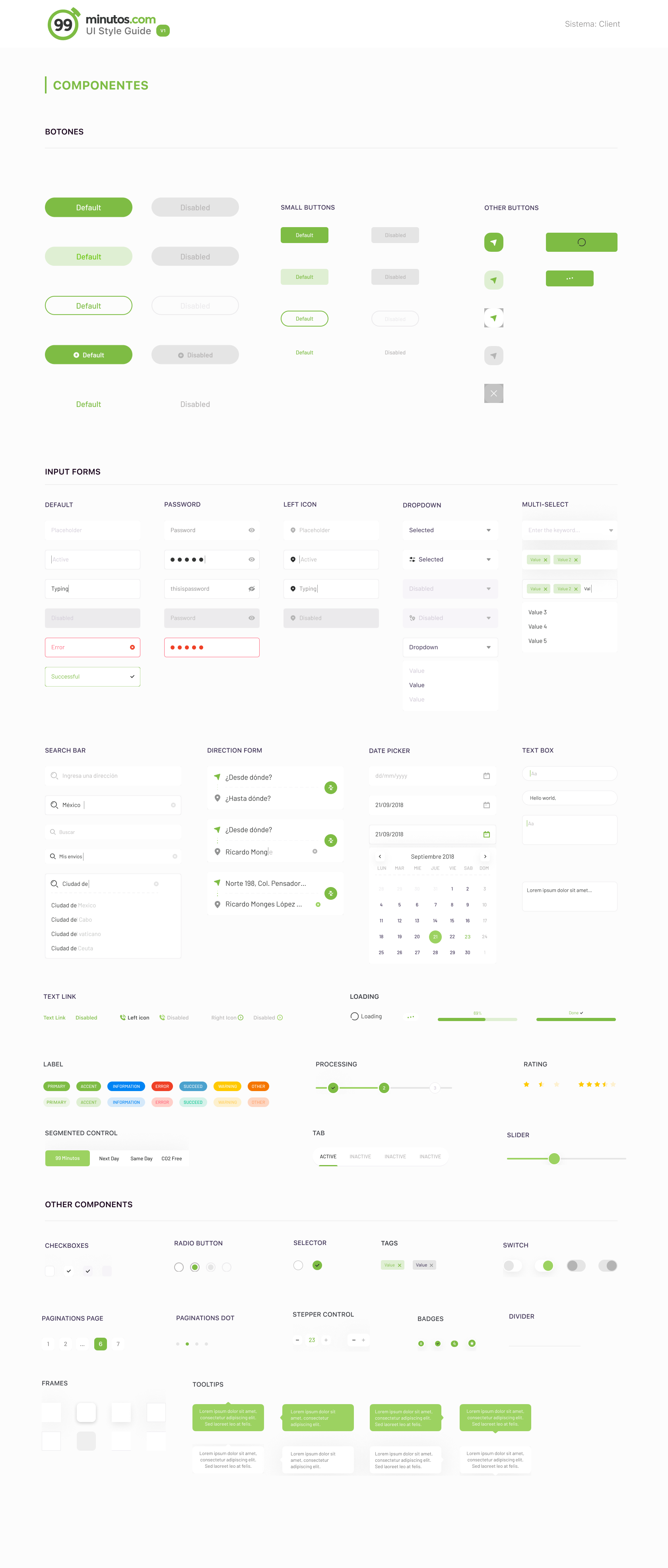
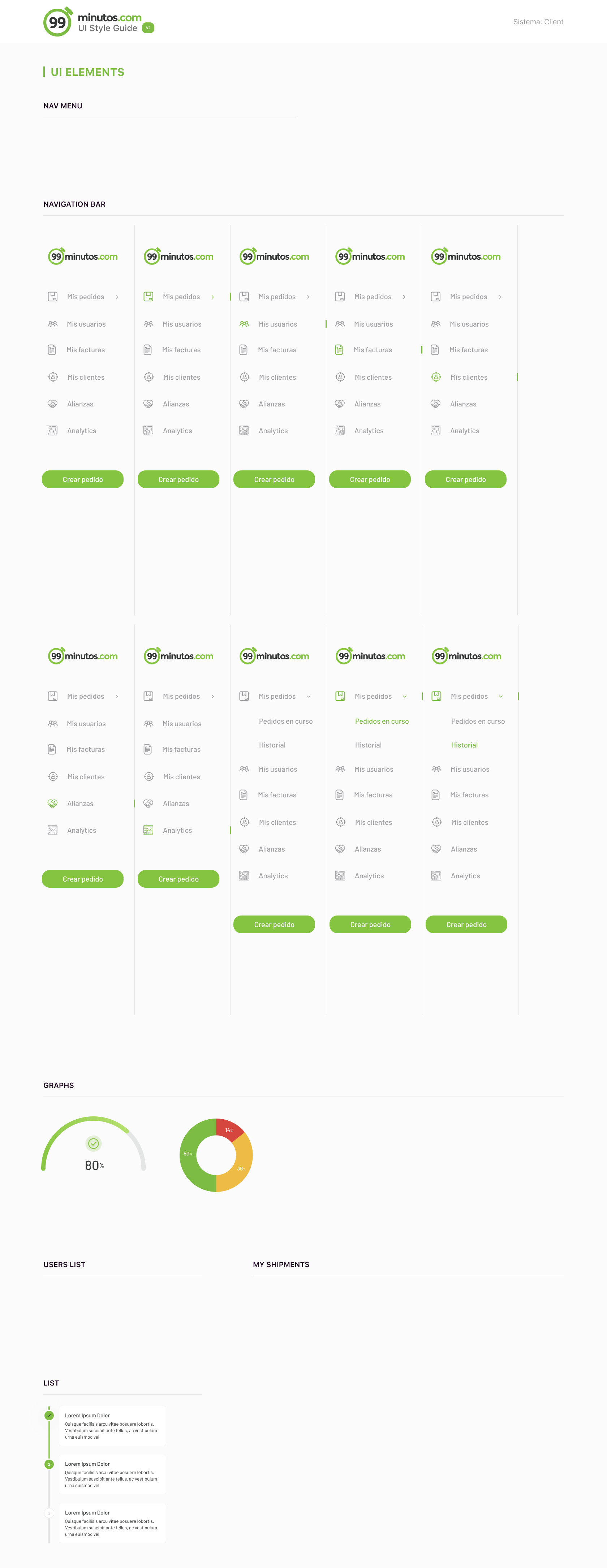
99 Minutos had a signature accent color, but no unified visual system. I retained the brand’s color while establishing consistent UI elements and layouts. This effort initiated discussions on a broader style guide to align other client products. I also produced CSS code to ensure fidelity between design comps and implementation, elevating design-to-dev handoffs.


05. validation
I conducted validation testing with 30 participants on both mobile and desktop prototypes. Results were:
99% found the product easy to use and clear to navigate
100% understood how to contact the courier
90% understood the package status without confusion
90% found the email redesign more trustworthy and effective
84% would recommend the service to a friend
Once implemented, this solution increased delivery success rate by 158% relative to the pre-project baseline.
0.6 personal takeaways
The solution should always be based on users’ needs and pain points
I learned that design decisions must be grounded in research evidence, not intuition. In early ideation, I leaned on aesthetic ambition too heavily. Re-anchoring on user pain points ensured both design effectiveness and stakeholder alignment.
As this was one of my first projects where I was a lead, trying to come up with a really ‘wow’ solution was on my mind. It was easy for me to rely on my imagination and my aesthetics more than on the research. I felt my ambition was driving me away from the actual solution and I didn't want this project to turn into a vanity project.
I took my first designs created under ideation process and tore them apart trying to match every feature with the pain points and business KPIs. They didn’t comply as well as I wanted them to. So I revisited my research and try to read more upon delivery services to get a bigger scope.
After that pause, everything started running smoothly and fast, I was able to articulate my design decisions and reflect them in the final product.
This project taught me that we as designers should separate from our ego, and know we can benefit from participatory processes and lear a lot from people who don’t wear our ‘designer’ label.
Curious about the whole project?