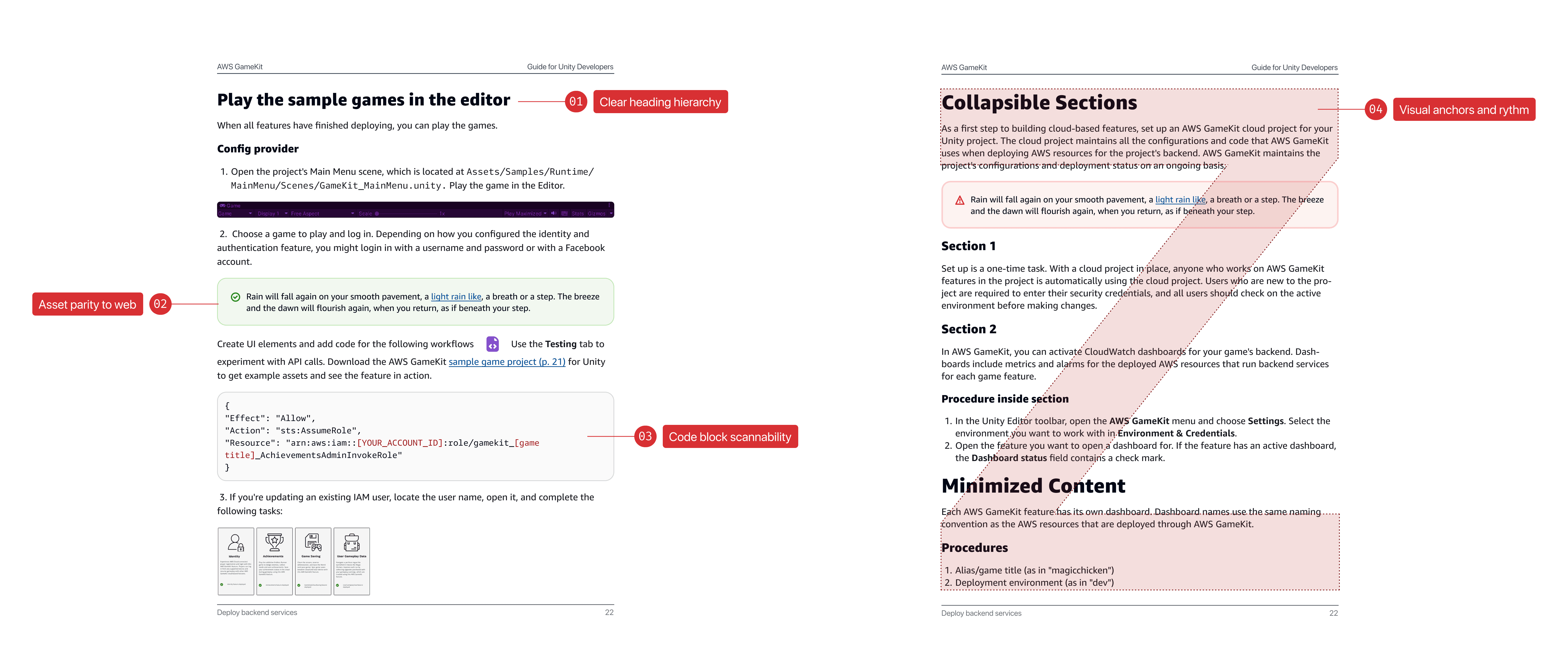
My impact
The redesign turned documentation into a retrieval tool. Developers completed lookup tasks 30% faster (n=12), consistently hitting sub-10-second retrieval on unfamiliar documents.
WCAG 2.1 AA was achieved on first pass — eliminating remediation across 200,000+ documents.
WCAG 2.1 AA
First-pass compliance
0 remediation cycles · token-driven
30% faster
Time-to-information
n=12 · timed retrieval tasks
200K+
Documents Improved
Programmatic rollout · no manual pass
<10s
Target retrieval time
Unfamiliar document lookup
Problem
What looked like a visual refresh
was a workflow infrastructure problem.
Developers weren't reading these documents. They were using them mid-implementation, mid-debugging, mid-code review — arriving with a specific parameter to find in under 10 seconds. The baseline system failed that task consistently.
Original brief
"Visual refresh"
Reframed to
"Developer workflow improvement"
Five constraints.
Set before any layout was explored.
Constraint 03 is the load-bearing one — it eliminated "beautiful but manual" solutions before they wasted anyone's time, and made the full-redesign argument to engineering unavoidable.
01
Accessibility First
WCAG compliance is a baseline, not an enhancement. If it isn't in the tokens, it isn't in the system.
02
Readability over Density
Optimize for finding one thing fast, not reading front to back. Developers retrieve, they don't read. Density ≠ efficiency.
03 ◆
Systemic Scalability
Every decision must apply programmatically. No manual exceptions. No maintenance debt. This principle eliminated "beautiful but manual" solutions before exploration began.
04
Brand Consistency
Aligned with Cloudscape — AWS's modern design system — not reminiscent of it. The visual gap between web docs and PDFs was a trust gap.
05
Complementary Parity
Same information architecture as web documentation. Different visual system, same mental model. Developers switch surfaces constantly — the PDF can't contradict the web.
Key decision
Engineering wanted a patch.
I held the line on full system redesign.
Engineering position
Targeted patch
Address the visible failures — font size and obvious contrast — without touching the typography token architecture. Faster to ship. Lower upfront cost.
Design argument
Full system redesign
WCAG compliance outside the tokens means manual review at every publication, indefinitely. The patch eliminates symptoms without eliminating the cost.
The argument that closed it: recurring manual WCAG review at 200,000+ document scale costs more than a one-time redesign within two publication cycles. That framing held through three engineering review rounds.
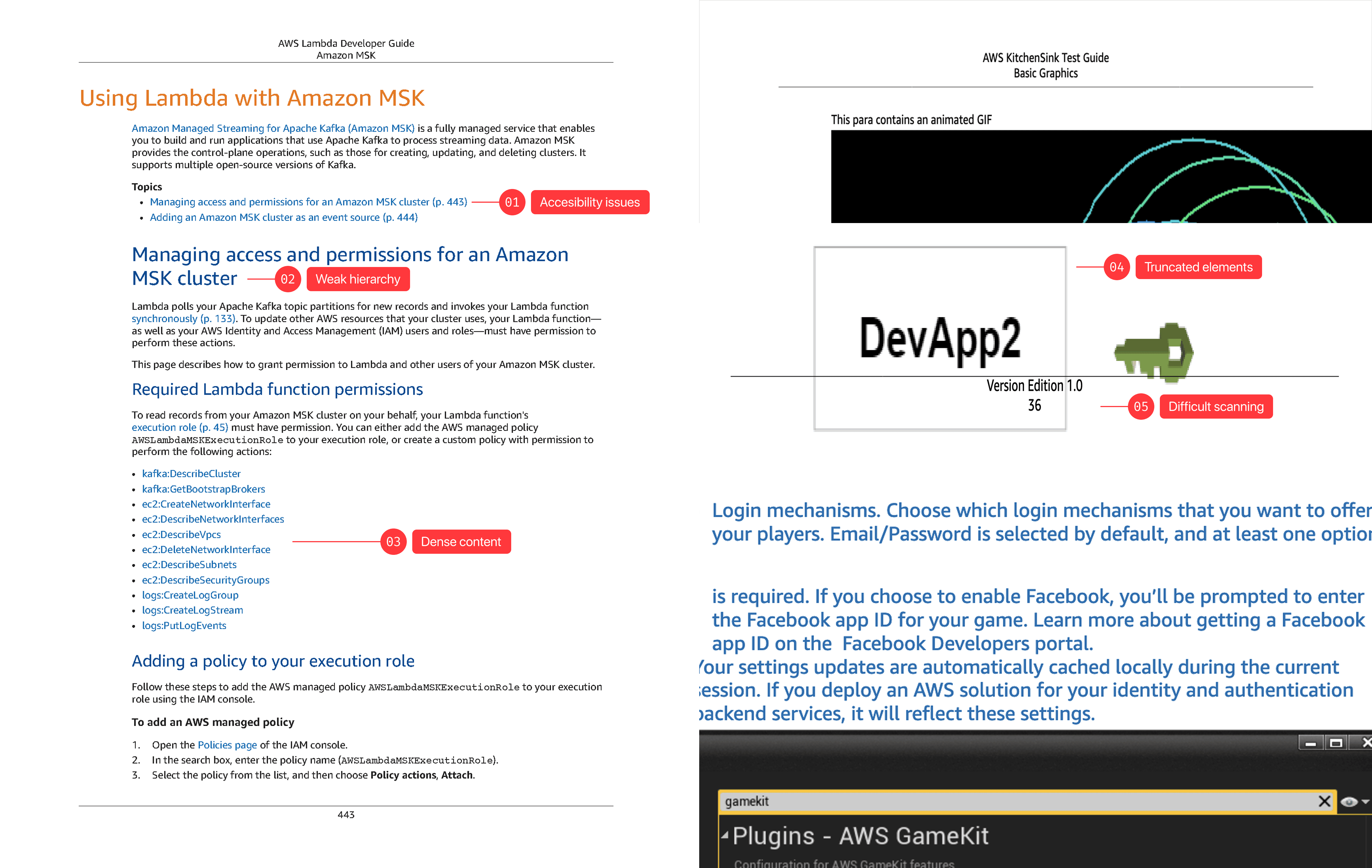
Visual Design Testing
Three layouts. Timed retrieval.
The data killed the density assumption.
The test: find a specific code parameter in an unfamiliar document under time pressure. Hierarchy and code legibility determined performance — not information density. Readable produced longer documents. The 30% task completion delta made that objection irrelevant.
Failed — Slow Retrieval
Dense
Line height
16px
Body / h1
11px / 24px
Code blocks
8px · no syntax hl
Compressed scan lanes. Code and prose at equal visual weight — parameter names don't separate pre-attentively.
✓ Selected · +30%
Readable
Line height
18px
Body / h1
12px / 26px
Code blocks
12px · full syntax hl
Vertical scan position preserved. Full syntax highlighting — token found before the line is read.
Failed — Excess scrolling
Wide
Line height
20px
Body / h1
12px / 28px
Code blocks
14px · minimal hl
Related elements over-separated. Airy spacing increases distance between query and answer under pressure.
Design System
AWS Documentation · Type & Component System
The deliverable was not a page — it was a system of tokens and components that generate readable, accessible documentation programmatically.
Challenge
Document Density
Option
Keep dense layout and optimize for document length
Decision
✓ Prioritize readability
Challenge
Accesibility
Option
Minimal compliance, fix just immediate issues
Decision
✓ Full system redesign optimizing all components
Challenge
Brand alignment
Option
Keep neutral docs not aligning to source of truth: Cloudscape
Decision
✓ Integrate with web design system and brand
Readability, accessibility, and brand consistency were constraints, not preferences. Encoded into tokens and components that apply programmatically across the platform.
Component System · Shipped interaction improvements
Components separate content types — code, prose, navigation — for non-linear scanning. Heading hierarchy creates scanning landmarks without reading. Syntax highlighting enables pre-attentive parameter identification. Navigation anchors support non-linear access in long documents. Every decision is programmatically enforced.
From rules to output · Before & after
Each change maps to a diagnosed failure. Applied programmatically across all documents — not one-off corrections — the system produces consistent retrieval improvements at platform scale.
AI Integration
How I would use AI if approaching this project today
This project was completed in 2023. AI was not part of the workflow. The section below is a retrospective reflection on where AI would change the approach — it is not a description of how the project was actually run.
Corpus audit at scale
The accessibility audit ran manually on a sample. AI makes the full 200,000-document audit tractable before the first stakeholder meeting — failure distribution quantified, not estimated.
Semantic validation at publication
The shipped system enforces visual compliance. It can't catch semantic failures — deprecated parameters, broken heading nesting, mismatched API versions. AI adds that layer before publication.
Impact
30% faster retrieval.
WCAG 2.1 AA. Zero remediation cycles.
WCAG 2.1 AA on first pass, no remediation cycles. 30% faster task completion in timed usability testing. 200,000+ PDFs improved through the token architecture — not manually, one by one. These outcomes were enabled by the system architecture decision, not the visual direction alone.
The n=12 usability sample is a real limitation. First-pass WCAG compliance is the more structurally defensible outcome — it's a property of the token architecture, not a tested sample.
Reflection
Framing determines outcome.
Framing this as a maintenance cost problem — not a design improvement — aligned engineering and unlocked full scope. Introduced earlier, it would have avoided multiple review rounds. The redesign improves retrieval within documents, but the more important question going forward is the surface itself — as IDEs and AI increasingly reduce reliance on static documentation.
Summary
TL;DR
Problem
Documentation failed as a retrieval tool — developers couldn’t find critical information under time pressure.
Approach
Reframed the work as a workflow system, not a visual refresh — designed and encoded decisions into a scalable token-based system.
Outcome
WCAG 2.1 AA on first pass, 30% faster info retrieval, applied programmatically across 200,000+ documents.
Signal
System-level thinking — turning design decisions into infrastructure that scales, performs, and removes ongoing cost.