Selected Work
When every interaction is a trust signal, ambiguity is a product failure.

Timeline
Jun - Nov 2021
Implemented
Skills
Interaction design
Prototyping
Micro-interaction
My Role
Design strategy
IxD
Prototyping
Team
PM
UX Researcher
UX Manager
Me
My impact
Turned sync from a hidden system process into a readable, actionable interface layer.
- 32%
Support tickets related to sync status and file state confusion
+ 41%
Successful conflict resolution without escalation
–27%
User misinterpretation of file status (idle / syncing / synced)
+22%
Increase in user-reported confidence in sync reliability
Problem
The system worked. The interface failed to communicate its state.
The sync engine was functioning correctly. Files uploaded, conflicts were detected, and errors were surfaced. The failure was in the interface: idle, syncing, and synced were too visually similar to tell apart, while conflict and error collapsed into the same signal. Users weren’t reacting to broken system behavior. They were reacting to ambiguous state communication.
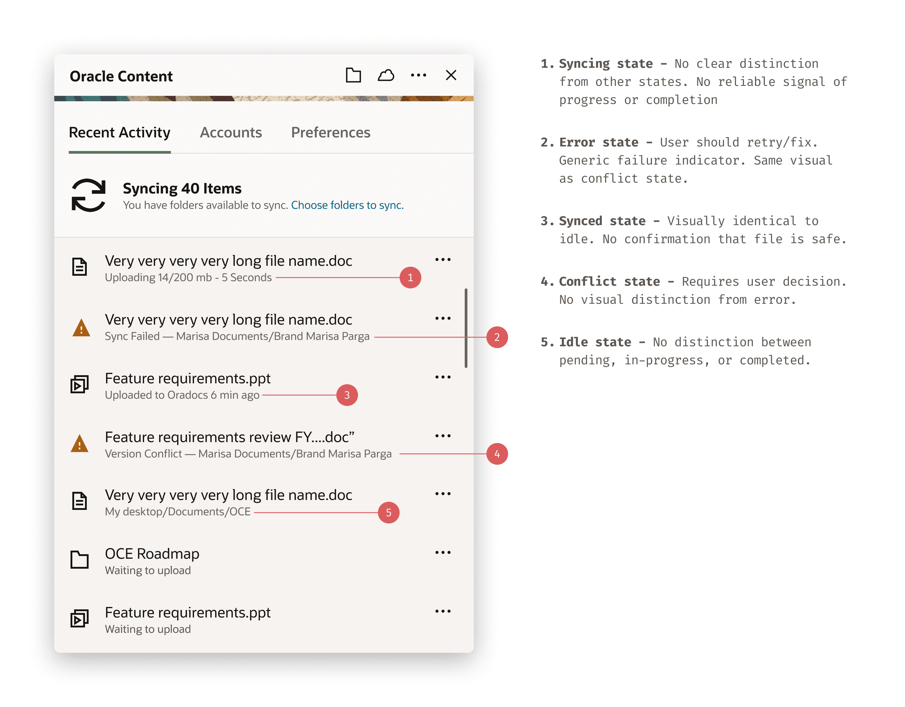
Idle ≈ Synced ≈ Syncing
Three distinct file states shared the same visual treatment. No reliable read of safety without manually checking.
Conflict = Error
A version conflict and a sync engine error produced identical indicators. Different causes, different required responses — indistinguishable in the UI.
Support load pattern
Tickets traced to state transitions. Users contacted support not because something failed — because they couldn't tell what had happened.
System
The problem wasn’t visibility. It was indistinguishable states.
I introduced a state communication system directly in the activity panel—the surface users were already scanning—so state could be understood without opening files or switching context.
Each file row carries its own state inline. The goal wasn’t to add UI, but to make the existing surface do the work.
The constraint was small-scale recognition. These signals had to hold at ~18px, in peripheral vision, under continuous change.
That ruled out relying on a single cue. Color alone fails at small sizes. Form alone fails under rapid scanning. Motion only works for active states.
So I redesigned the status system as a distinct visual vocabulary: progress, completion, interruption, and conflict each needed a signal users could identify at a glance.

State is communicated directly on file rows, where decisions already happen. No additional panels or flows are required.
This turns the activity panel into a readable system: each condition remains distinguishable even when one signal channel fails, and file state can be understood immediately, without inspection.
In testing, users could not reliably distinguish between file states without opening them.
After introducing distinct state signals, users correctly identified file status at a glance, eliminating the need for manual verification.
Solution
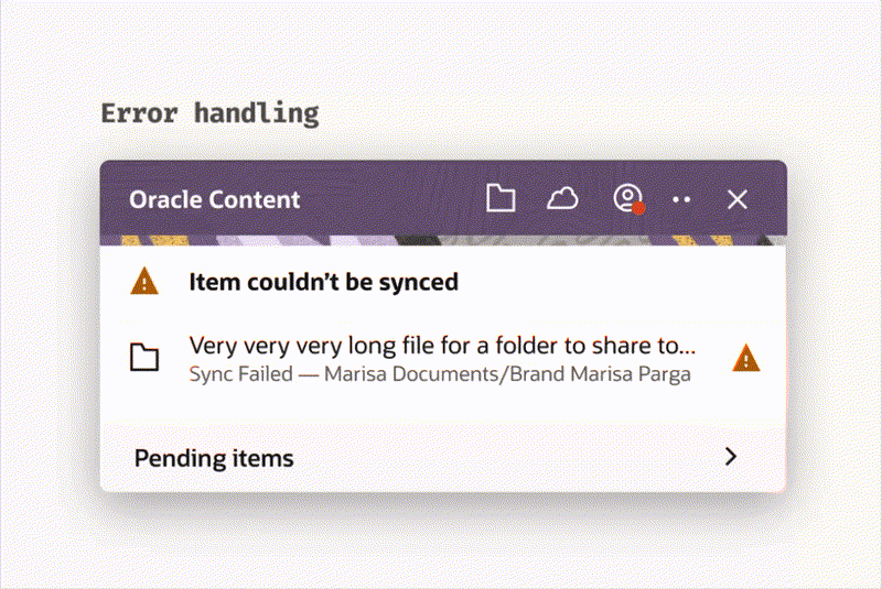
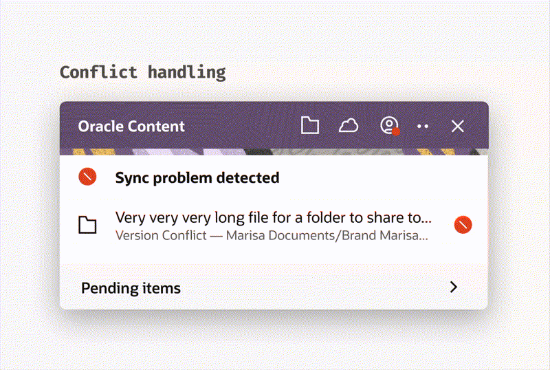
Two different failure conditions. Different behavior, not just different visuals.
Version conflicts and system errors were treated as the same condition.
They’re not.
A conflict is user-resolvable — the system is intact, but the file requires a decision.
An error is system-blocking — the file cannot proceed without recovery.
The UI now reflects that difference:
Conflicts expose resolution paths (compare, keep, replace)
Errors expose recovery actions (retry, system feedback)
Passive states remain non-interactive
The distinction is not visual polish. It determines what the user can do next.
The outcome is not a new flow — it's a clearer system. Conflict and error become distinct readable states in the activity panel, replacing a single ambiguous indicator with two specific ones. The user knows what happened before they open anything.
System outcome
Final state model — unambiguous at a glance.
Every file state communicates two things independently:
progress (where it is in the system) and risk (whether action is required).
No two states share the same visual signature.
Users can scan a list and understand system status without opening a file, checking logs, or guessing intent.
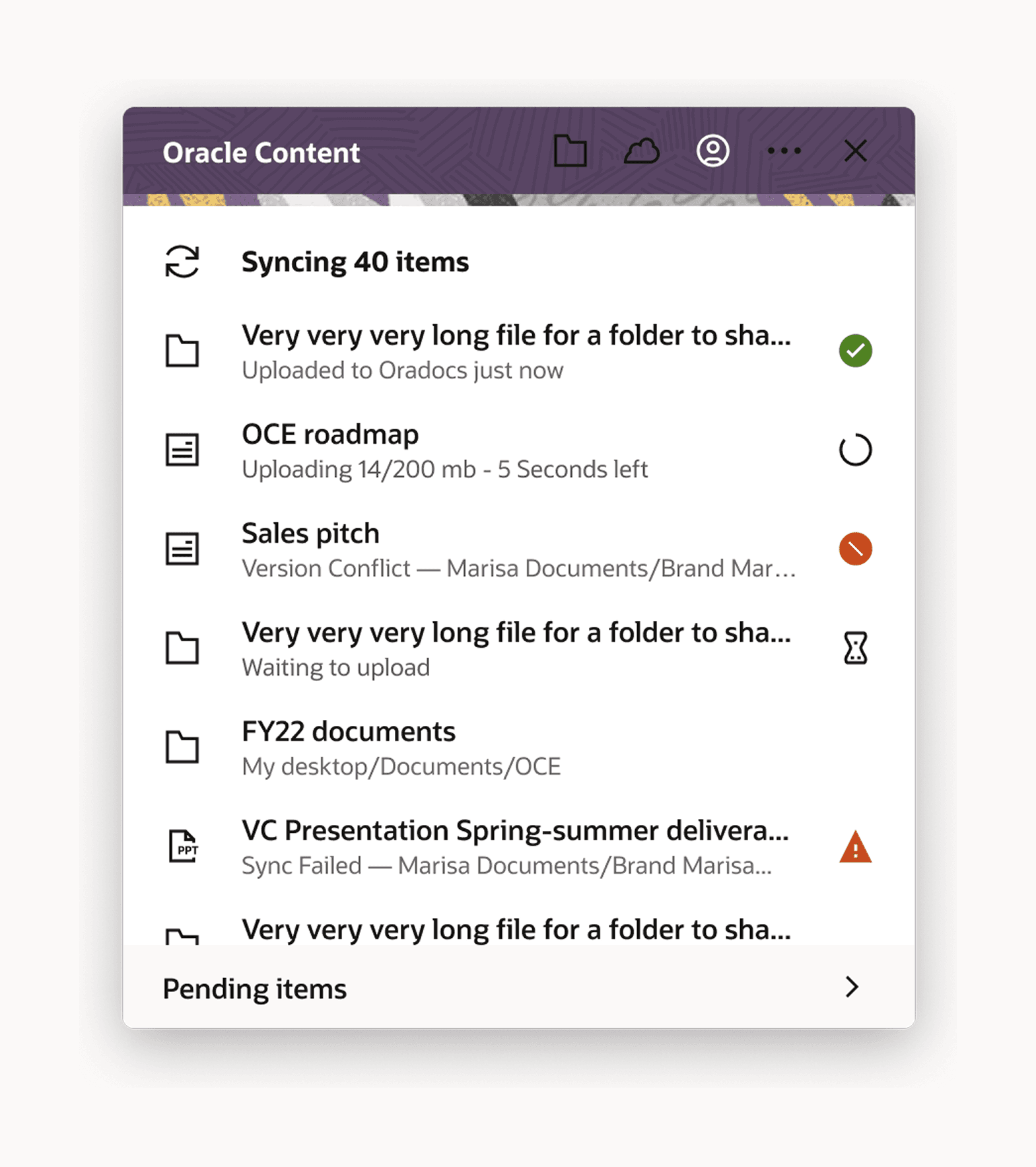
Each state was designed to communicate three things instantly:
what’s happening, whether it requires action, and what kind of action is possible.
Status indicators, row hierarchy, and inline messaging were aligned so users could scan vertically and identify blocking states without inspecting individual files.
Errors interrupt. Conflicts prompt decisions. Completed states recede.
Design rules
System constraints that made ambiguity impossible
The system was constrained so ambiguity couldn’t reappear:
States must be distinguishable without inspection
Color cannot be the only signal
Each state must imply the next action
No state requires hover or tooltips to understand
These constraints weren’t visual guidelines — they define how the system communicates at scale.
AI Integration
How I would use AI if approaching this project today
This project was completed in 2021. AI was not part of the workflow. The section below is a retrospective reflection on where AI would change the approach — it is not a description of how the project was actually run.
If approaching this system today, I would use AI to accelerate state validation, not define the model.
Pattern detection in support tickets
Identify clusters of state confusion earlier in the lifecycle.
Automated log classification
Distinguish between user-resolvable conflicts and system errors at scale.
Simulation of edge cases
Stress-test state transitions before release.
The system design remains deterministic.
AI improves speed of validation, not decision-making.
Reflection
The trust frame held up. I'd establish it earlier next time.
The communication failure was diagnosable from day one. Ticket data pointed directly to state ambiguity. I got there through iteration when I could have started there.
Cross-platform constraints belong in the brief, not the design process. Native execution per OS was the right call — it came through stakeholder input midway, not as a starting condition.
Differentiation is reactive; prevention is the next version. Distinguishing conflict from error is necessary but not sufficient. Detecting simultaneous edits before conflict occurs requires sync engine work that was out of scope.
Summary
TL;DR
Problem
A working system failed because its states were indistinguishable.
Intervention
Redefined the state model to separate progress and risk, and enforced non-overlapping visual signals.
Outcome
Users could understand system status at a glance without verification.
Signal
Reduced ambiguity-driven support and restored trust in system feedback.